Whether you have your own story in mind or are illustrating for someone else, I hope that this may be a useful guide for you in creating a picture book!
I’m going to start off assuming we already have a story in mind, as forming an idea and crafting a story are another matter.
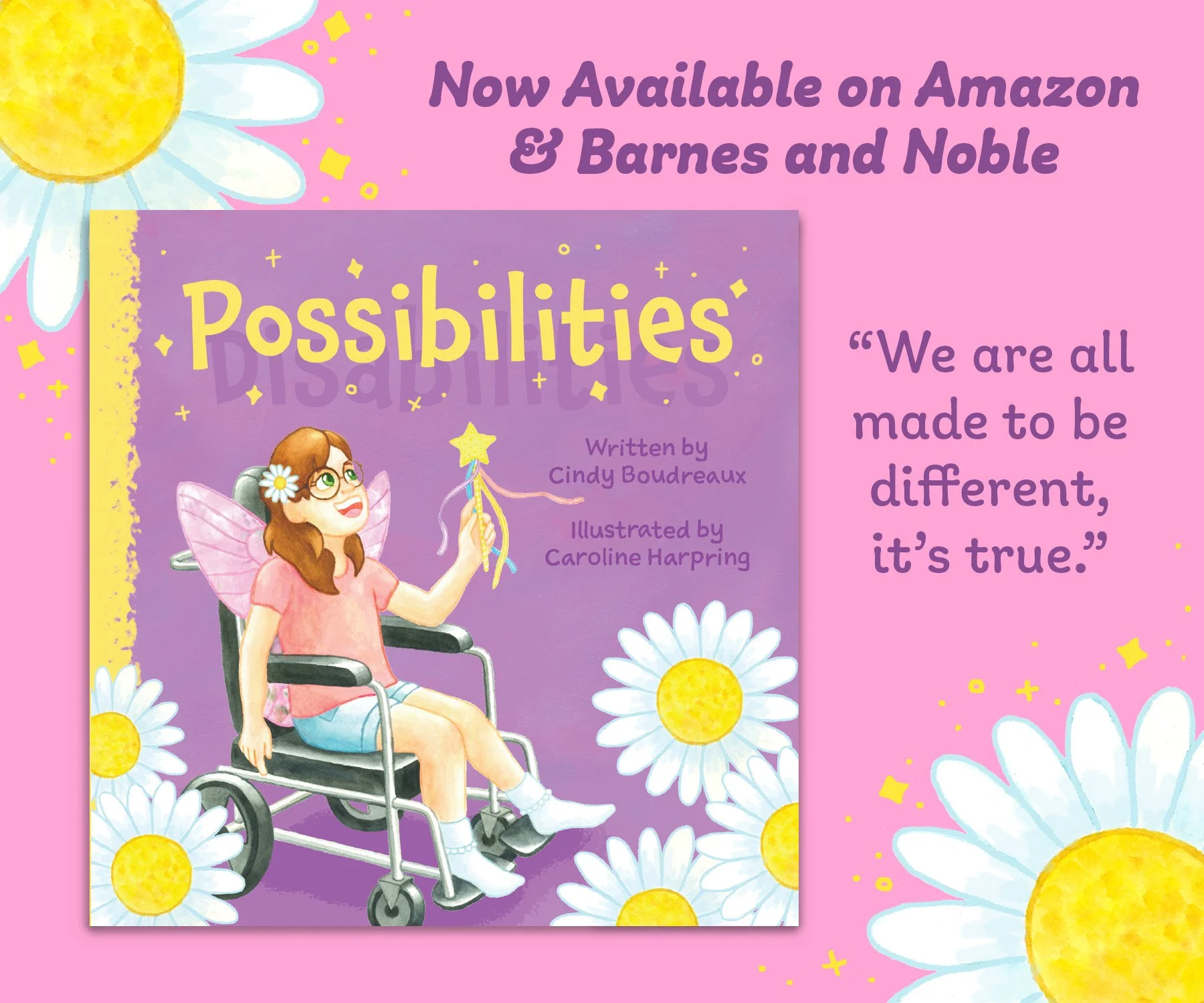
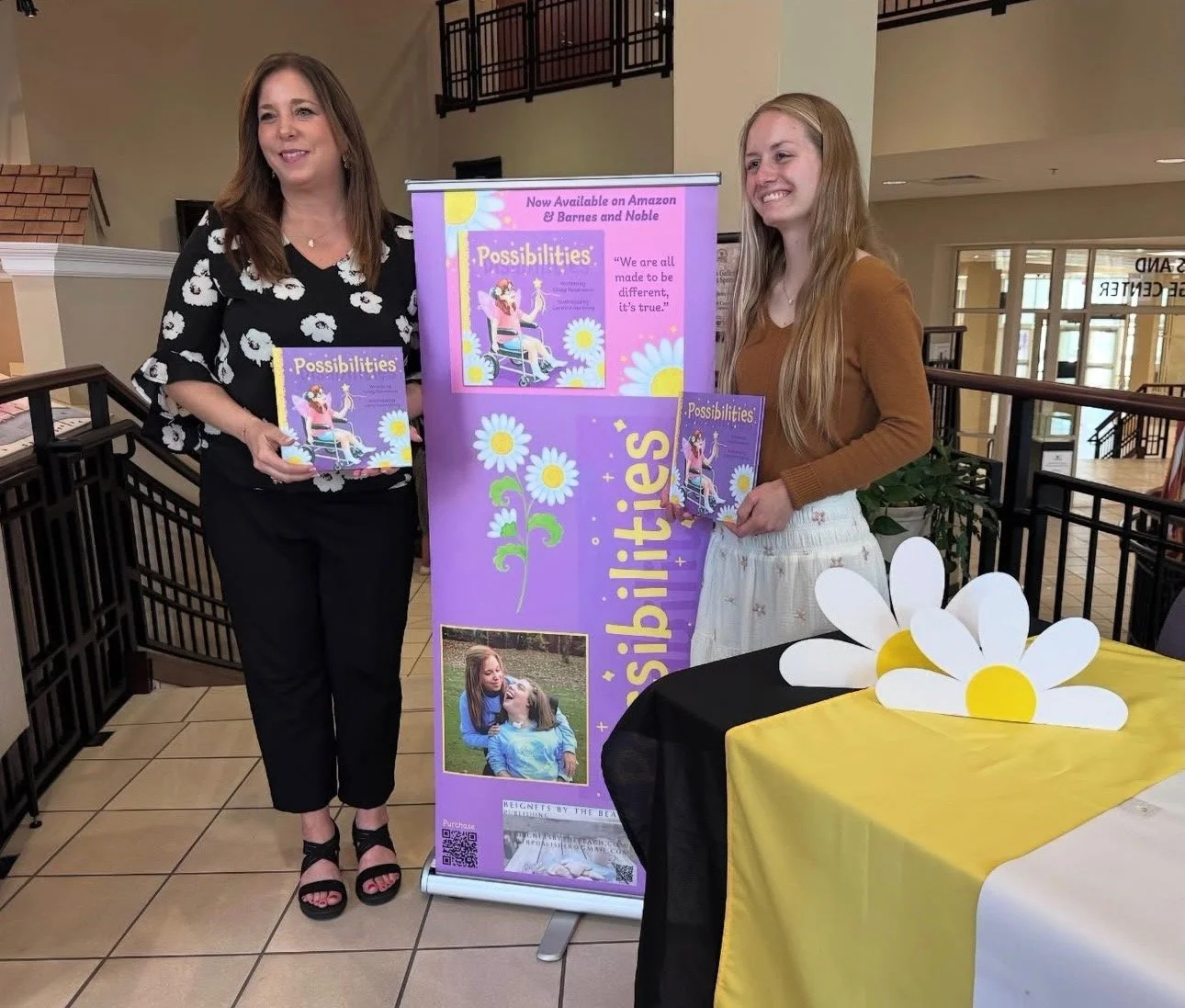
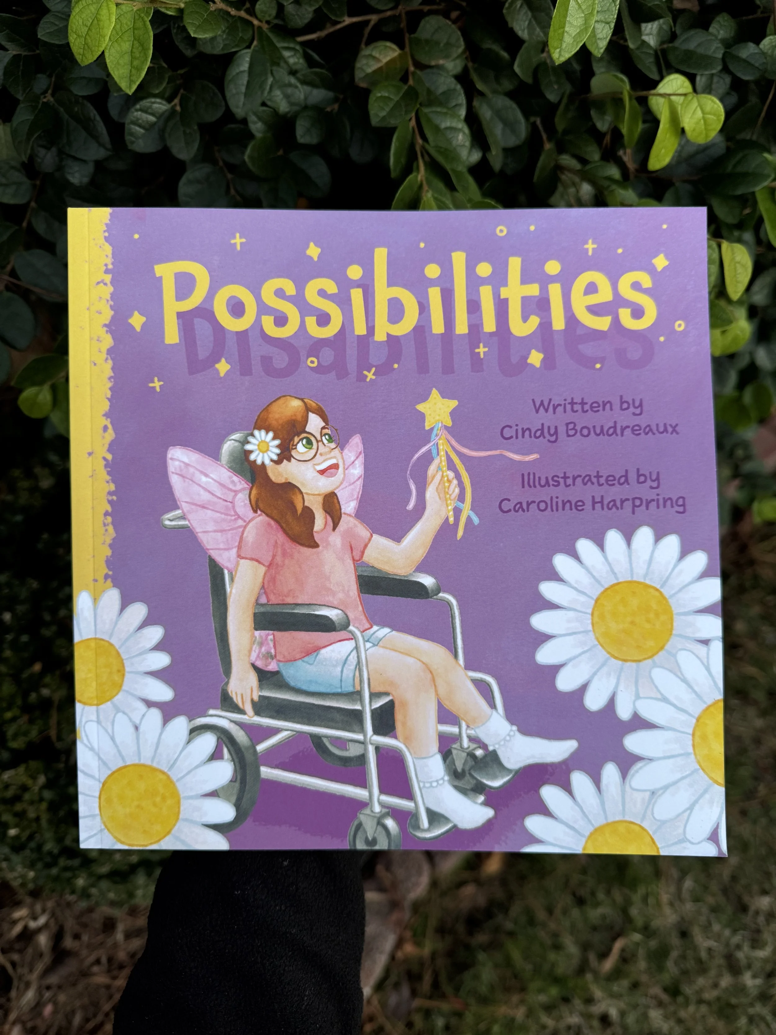
I’ll be using examples from my first picture book “Possibilities”.
1. Character design
2. Storyboard
3. Drawing
4. Painting
5. Cover design
6. Scanning and retouching images
7. Text and image formatting
Character Design
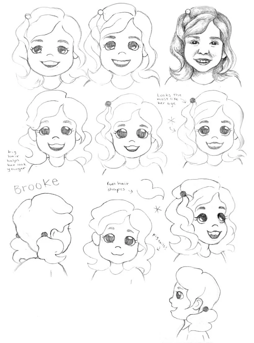
This is an essential first step if your story is driven by a main character. It’s important to consider their personality traits as those can inform or inspire their physical attributes. Lots of sketching is useful in seeing what does or doesn’t work for a particular character. Since this character is repeated throughout the book, drawing them in multiple poses is important to keep their design consistent. Often it may take a couple pages of sketching ideas. The goal is to create a character that is memorable and relatable - most especially to children!
Since Aly and her family are based on real people, I began by drawing them realistically and used that reference to afterwards characterize them. Essentially I simplified their natural features. This helps me think outside the box and vary my design instead of drawing each person with the same type of nose, for example.
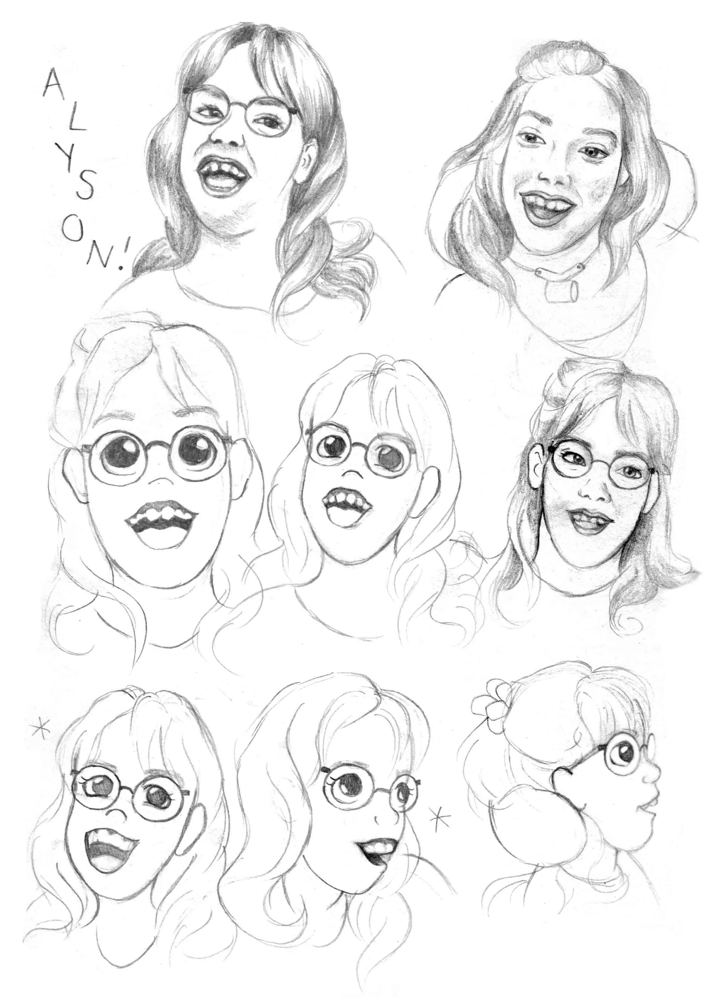

I intentionally designed Aly’s outfit to be fairly simple to make up for the complicated wheelchair that I had to draw about twenty times - haha! My favorite details are her glasses and socks. I think her most defining feature is her huge smile, as that was definitely so in real life. It reflects her joyful spirit.


Storyboard
Storyboarding is the process of mapping out each page and making sure the text and image flow concisely. This is the most important (and I think fun) step because you don’t want to have spent hours painting an image and realize you can’t fit the text without it looking messy or unreadable.
I sketch a few thumbnails (mini drawings) for each scene and draw a couple of lines as text placement holders. If you’re illustrating digitally, you may call these “roughs” and go ahead and sketch according to the size of the book in a digital program.


However this book was hand painted in watercolor so it was easy enough for me to create thumbnails in my sketchbook.
I strive to vary closeup views and faraway views, single pages, full spreads, and spot illustrations (standalone images without a background).
These thumbnails were discussed with the author before moving on to drawing.
Drawing
This step is pretty straightforward; I’m taking each thumbnail (or mini drawing/sketch) and refining it into a final drawing to then be painted in watercolor.
I had a rough plan for where the text would go from the storyboard so I printed out the text at the correct size (14-16 pt) and pasted it on each page so that I could draw around it. Without doing so, I very well could’ve drawn something too big and would have had to cram the text in haphazardly.


Illustrating traditionally does a require a few extra steps.
I drew each page to the book’s size including .25” for a bleed. I created a template to use when cutting spreads and individual pages. Each including extra space for a border to tape the paper down with.
At this stage it’s important to refer back to the original character designs. It’s crucial to make sure the characters look the same across each page. Often when you have to draw something multiple times, there may be slight changes (like a telephone game) where a character may look completely different the tenth time drawn vs the first.
Painting
Each page was hand painted in watercolor. I prefer the tactile nature of traditional media vs digital and it helps me tap into a childlike spirit since they begin making art with physical materials. Having such a large project really helped me develop a disciplined practice of painting.
Some may prefer to do a value study and a color study before the final painting, that is testing out color palettes and values. However I felt pretty comfortable with just going for it and using my intuition with each piece. Doing so takes experience and lots of practice. There were definitely many pieces in the past where I created value studies and color studies beforehand.


Cover design
Some may prefer to design and complete the cover before painting each spread, though I find it useful to begin the cover afterwards or halfway through painting the spreads. There may be a particular scene that would suit the cover well or inspire something similar. Plus the style of illustration is already established and the story throughly understood by the time it is completed with text and pictures.
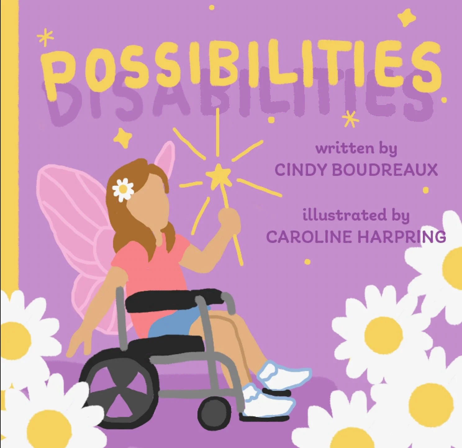

First I did various sketches and once we decided on a design we liked best, I created a digital color study. I completed the background, the character, and the daisies separately in watercolor and composited them in Photoshop.
This is where a bit of graphic design comes in! Typography is definitely a design element in itself as each is shaped differently and therefore expresses a unique mood. I was looking for a font that is fun and hand-written to reflect the fact that the story is told in first-person, as if written by Aly herself.
Scanning and Retouching images
Painting traditionally requires an extra step of scanning each image. If you don’t have fancy equipment, be resourceful! I used my local library copier. Scanning at 300 dpi or higher and exporting each scan as a jpeg or tiff is ideal for printing the best image quality. Often there may be specks of dirt and dust so each image is cleaned up in photoshop and the white border is cropped. Some color adjustments may be necessary as a scan may wash out the saturation.
After each image is clean and cropped, I convert them to a CMYK color profile. CMYK is the best color model for color printing as opposed to RGB which is used for images that will only be viewed on a digital screen. Now we’re ready to compile the illustrations and text!
Text and Image Formatting
At this stage we return to our storyboard where we mapped out each page to ensure that the text and image flow concisely. As said before, you don’t want to have spent hours painting an image and realize you can’t fit the text without it looking messy or unreadable.
I experimented with a few handwritten fonts since the author wanted it to feel as though Aly may have written the text herself.
As you can see, creating a picture book is quite the lengthy process, though it is absolutely worth the effort as it is such a treasure. I create art for many reasons, but ultimately its ability to connect with and impact someone through a story is unbeatable. Books are my passion for this very reason and I hope to bring many more to life.
If you don’t want to miss further behind-the-scenes, advice and updates, join my free newsletter.
Are you thinking about writing and/or illustrating your own picture book? Give it a go!